Wizards of the Coast Announces Changes to MTG Card Face (WARNING: Contains Spoilers)
Published By: Chris Alexander on January 6th, 2014
In an article published today on dailymtg.com by Aaron Forsythe called “From the Director’s Chair: 2013”, Mr. Forsythe reflects on 2013 and many of Magic the Gathering products released during fiscal year 2013, as well as some insight as to what consumers can expect in 2014.
But perhaps the biggest announcement is the change to the Magic the Gathering card face, as well as two spoilers for Magic 2015 (M15) – one of which is the card Wizards of the Coast asked the community to help design (pictured below, Waste Not):
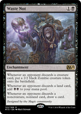
Notice the new text, font, and the stamp on the bottom of the card? Mr. Forsythe has this to say about the changes:
“What’s Going on with That Card Frame?
As you can see from the expansion symbol, Waste Not will be appearing in this year’s core set,Magic 2015. As you can also see, a number of tweaks have been made to the card frame.
I spent most of 2013 leading the design of M15, an ambitious set that will introduce a few new things to the game, not the least of which is an update to the existing card frame. We have a lot of smart people here in the building who are constantly thinking of ways to improve Magic. Many such ideas involved tweaks to the front of cards, but since we don’t want to make sweeping changes to card frames often, we let a few such ideas pile up for a while before picking an opportune time to deploy them in a big batch. M15 was that time.
There are five big changes visible above on Waste Not. Four are game-wide changes that will be implemented in M15 and every set going forward, and the last is a little something special just for this set. Let’s go over them.
1) The font
Since its inception, Magic has used off-the-shelf fonts on its cards. As a brand, we feel that we’ll be better served by having our own unique proprietary font—something with a little edge and character that is still very readable.
In general, we liked the heaviness and shape of the “Matrix Bold” font we’d been using previously, so there are a lot of similarities between the old font and the new, named “Beleren,” which should alleviate any jarring feeling when you mix the two together in decks.
2) The holofoil stamp
You’ll notice a little silver oval in the bottom center of Waste Not. That’s a new unique holofoil stamp that we’re applying to all rares and mythic rares going forward. This stamp makes those cards feel more special, as well as guarantees authenticity.
Commons, uncommons, and basic lands will not feature this stamp.
3) The collector info
In the lower left of the card is a series of letters and numbers that indicate the card’s collector number (122/269), rarity (R), set (M15), and language (EN). The little dot between the set and the language will be a star on premium cards, so just about everything you’d ever need to know about a card’s edition is in one easy-to-read place.
Making the bottom of each card black to accommodate this information was not an easy decision, and may be the most disconcerting part of this frame update, but it was done with the best of intentions. This information is machine-readable by recognition software at our production plants. It will help eliminate the rare packaging error, like cards sneaking into the wrong expansion’s boosters.
4) Decreased border size
In order to fit all this cool new stuff on the cards, we’ve reduced the width of the black border by almost a millimeter all the way around. This reclaimed real estate allows us to have slightly bigger art and text boxes as well.
5) The designer credit
You’ll notice that we gave you all credit for making this card in the place normally occupied by flavor text—”Designed by the Magic community.” This is the first time we’ve ever given credit for a specific card design on the card itself, and it’s you! You should be very proud! While every card going forward won’t feature a designer credit (kinda sad, really), there are a handful of others inMagic 2015, specifically, that will. (You’ll have to wait on those details! It’s cool, I promise!)
Those are the main components of the card frame update. Here’s another M15 card for comparison. This one isn’t rare, so it has no stamp; is a creature, so it has a P/T box; and isn’t black, so you can see the frame design more clearly. All in all, it is an impressive modernization of the card frame, one I’ll be excited to get my hands on this summer with M15.
About Wizards of the Coast
Wizards of the Coast LLC, a subsidiary of Hasbro, Inc. (NASDAQ:HAS), is the leader in entertaining the lifestyle gamer. Wizards’ players and fans are members of a global community bound together by their love of both digital gaming and in-person play. The company brings to market a range of gaming experiences under powerful brand names such as MAGIC: THE GATHERING, DUNGEONS & DRAGONS, and KAIJUDO. Wizards is also a publisher of fantasy series fiction with numerous New York Times best-sellers. For more information about our world renowned brands, visit the Wizards of the Coast Website at www.wizards.com.
Join the Battleground Games & Hobbies Community!
Please don’t forget to like us on Facebook and follow us on Twitter @battleground_gh!


© Copyright 2012 Battleground Games & Hobbies
Designed by
![]()
contact@battlegroundgames.com | (781) 261 - 9640

Social: